
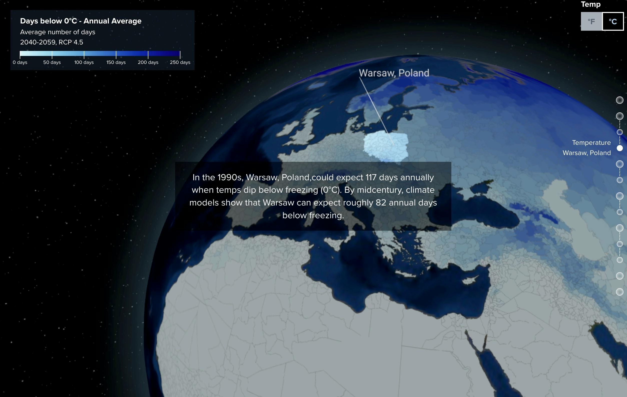
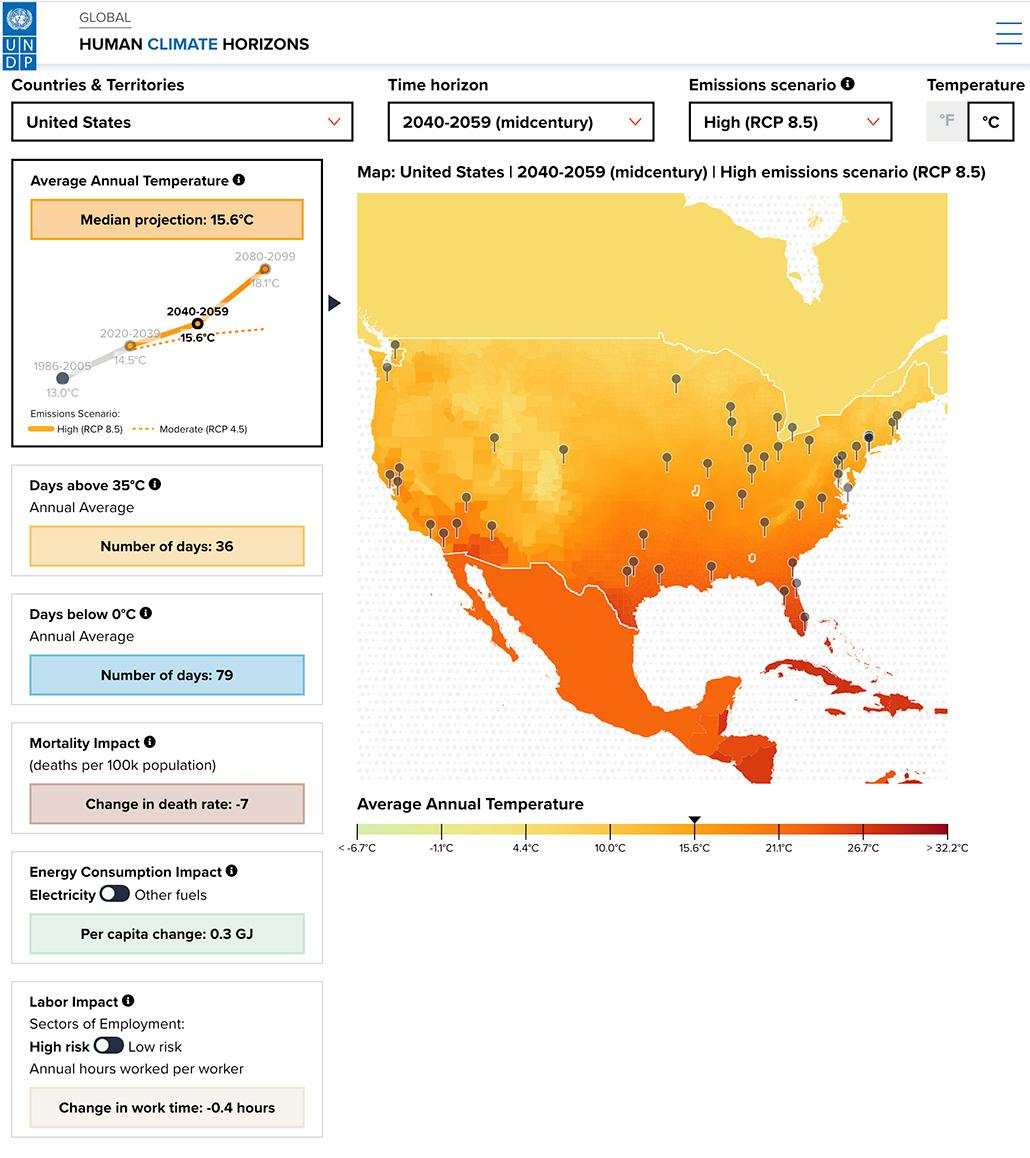
Human Climate Horizons is a data visualization project that explores the impact of climate change on human development. The project was developed in collaboration with the United Nations Development Programme (UNDP) and the Climate Impact Labs.
We visualized how temperatures will change over the next 80 years as well as the impacts that will have on human mortality, energy consumption and labor production. We showed how these impacts will vary by region and country both on a 3D globe and on 2D maps. Users can select from two different climate scenarios as well as different time periods to see how the impacts will change over time.
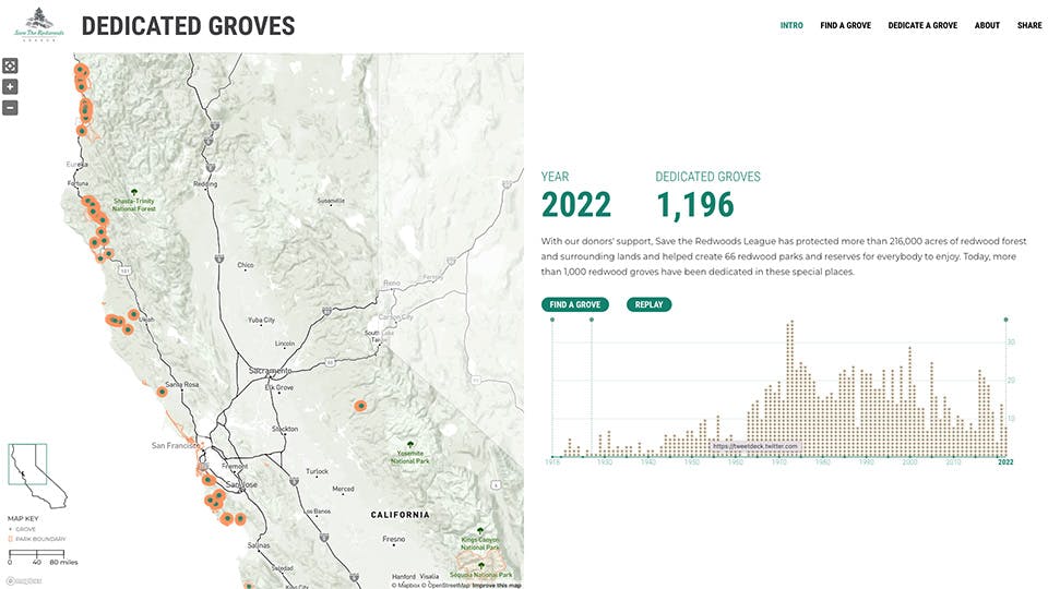
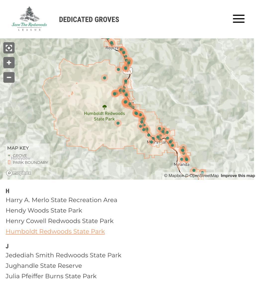
The Dedicated Groves Tribute is an ongoing project by the Save the Redwoods League, an organization that protects and restores California Redwood forests. This project visualizes the numerous dedicated redwood groves across California.
We used Mapbox to plot the various groves throughout the state. The project is backed by a custom CMS built on Google Firebase. The CMS allows the League to add new groves and edit existing groves, and upload photos. Custom Mapbox styles were created to match the look and feel of the Save the Redwoods League website.
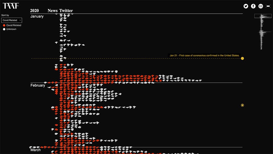
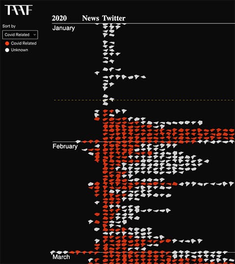
Decoding Asian American Hate is an interactive data visualization project that explores the rise in anti-Asian hate crimes in the United States. The project was developed alongside The Asian American Foundation (TAAF).
Using daily data from Twitter and news websites, we cataloged anti-Asian hate crimes in the United States. We used React Three Fiber and Three.JS to visualize 1000s of incidents reported in the news and online. Viewers can see incidents on a timeline and filter by gender, location, Covid-19 relation and more. A timeline of events is also included to help viewers understand the historical context of the rise in anti-Asian hate crimes.
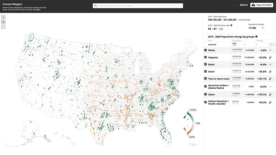
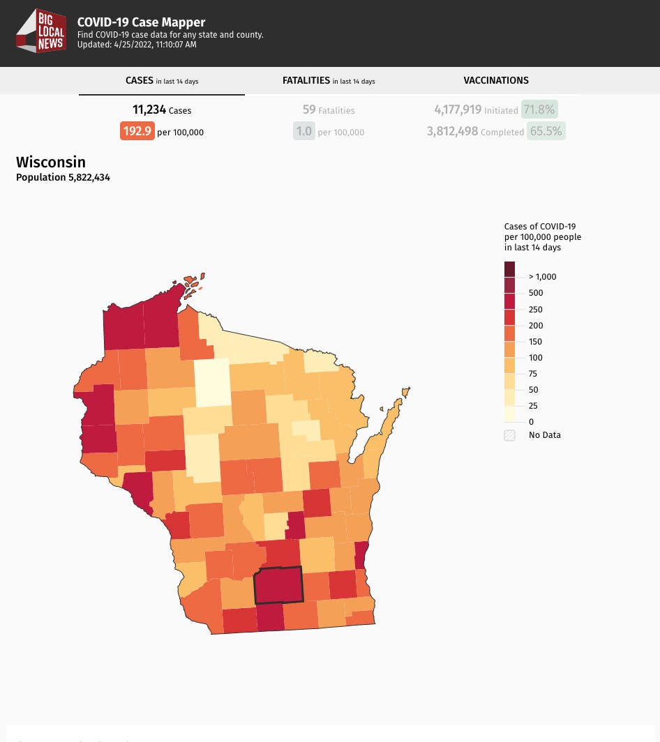
We worked with Big Local News, a data journalism team at Stanford, to create interactive mapping tools visualizing the Covid-19 pandemic as well as maps of the 2020 Census.
The maps were designed to be customizable and embeddable to enable small news rooms across the country to provide accurate and local statistics to their local audiences. We created maps showing the spread of Covid-19 cases, mortalities and vaccinations. We also created a map of the 2020 Census to help newsrooms show the changes in communities, populations and demographics.
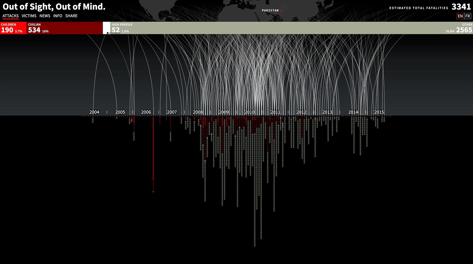
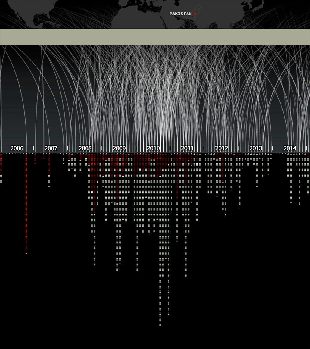
Out of Sight, Out of Mind is a data visualization piece that explores the impact of drone strikes on civilian casualties. The project was developed alongside the Bureau of Investigative Journalism (TBIJ).
We visualized the impact of drone strikes on civilian casualties in Pakistan. TBIJ categorized each strike victim as either a child, a civilian, or other (an alleged militant). We visualized the strike victims by type over time. Additional context is provided about political and military events that may have influenced the strikes.
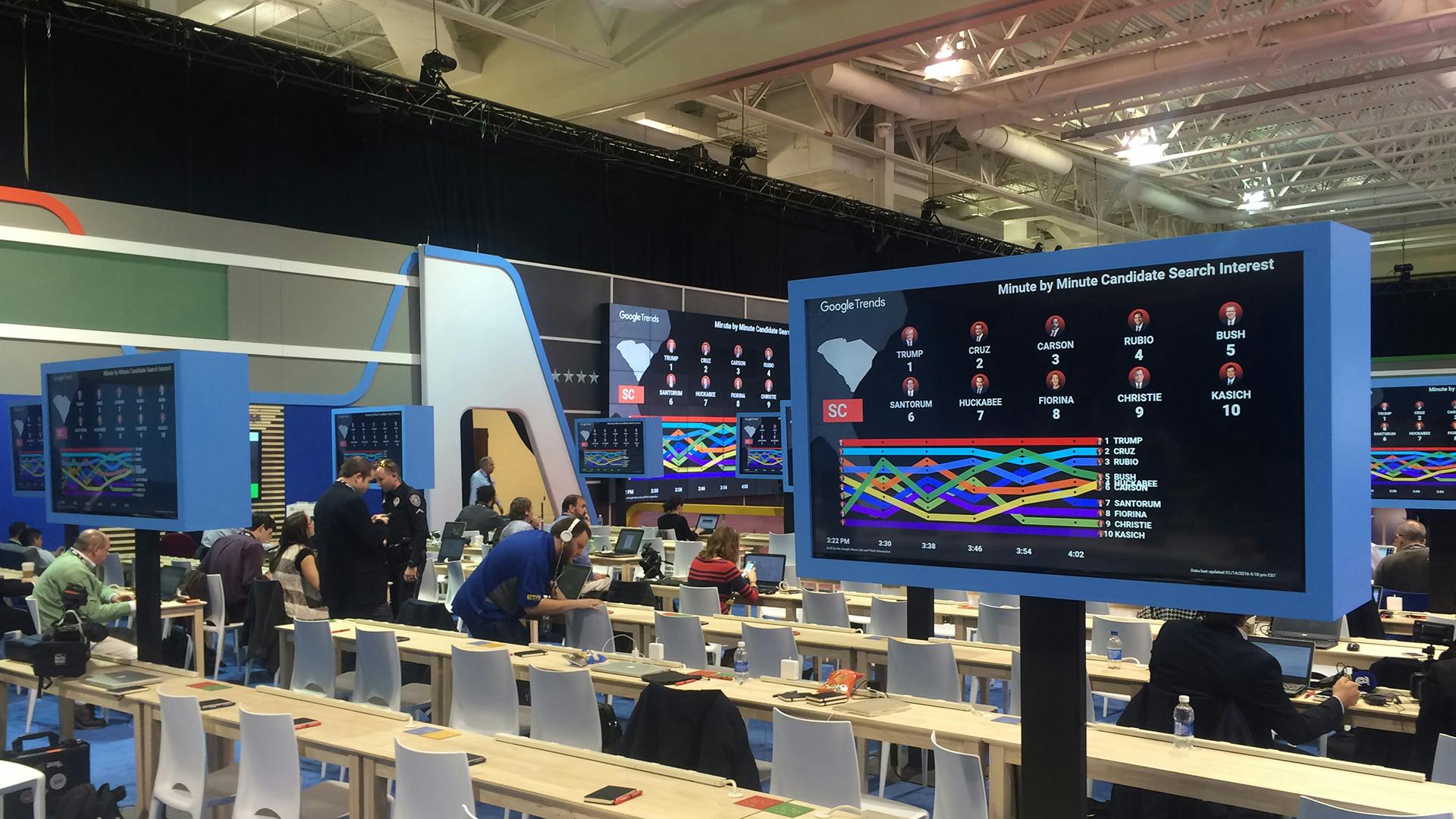
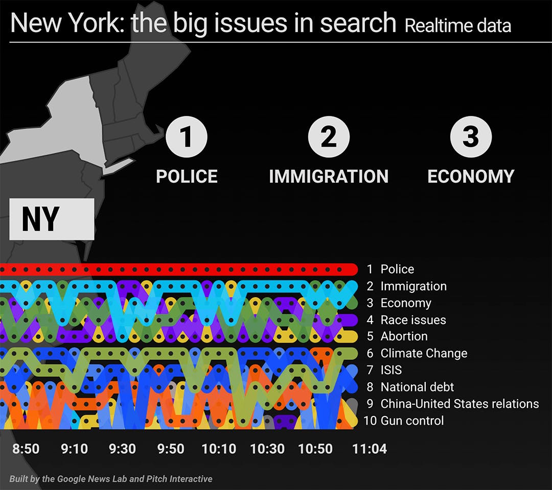
In 2016, we worked with Google to create a series of interactive data visualizations for the US Presidential Election. We visualized how people were searching for candidates and election issues in realtime on Google.
The visualizations were presented on large screens at candidate debates and political conventions. We used React and D3 for the frontend, and Google App Engine was used for hosting and data collection. A custom CMS was built so that the visualizations could be customized for each event. The project was a big hit and similar visualizations were used for elections in Brazil, Germany & more.
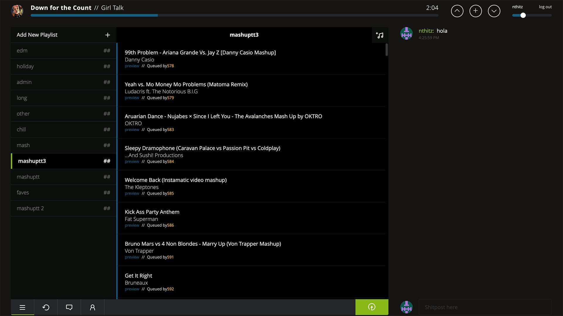
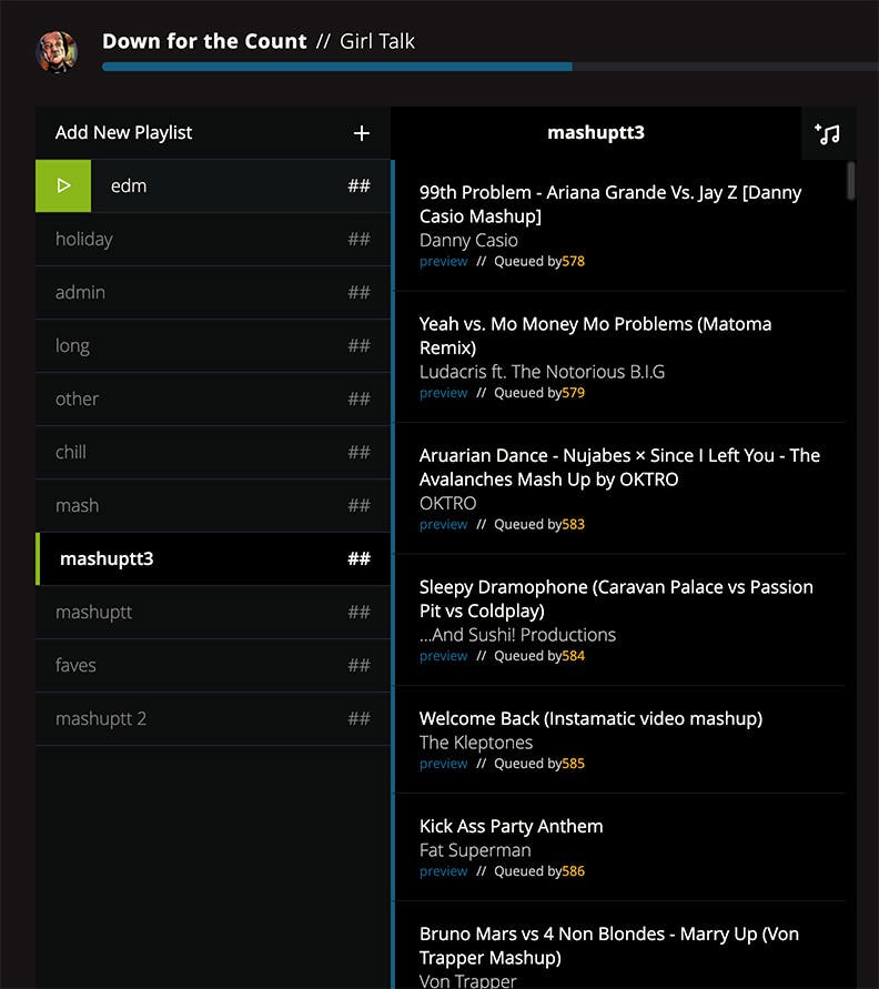
Mashup.fm was a social music DJ site focused on playing mashup music. It was built using React, Express, and Postgres.
Mashup.fm was created by a group of friends who wanted to create a social music site that focused on mashup music after the first demise of turntable.fm. The site supports a virtual DJ queue, and allowed users to import songs from Soundcloud, Youtube or their computer. DJ's could queue songs for all users of the site to hear synchronously as well as chat with the other users about the songs.
TurnDownForWhat.JS (TDFW.JS) is a silly bookmarklet that lets webpages dance. It embeds the music video for the song Turn Down for What by DJ Snake and Lil Jon, and then animates the elements of the DOM so that they dance to the beat.
The project was motivated by wanting to use the layout of existing websites creatively. Websites may be written by others, but they can still be modified and displayed in new and interesting ways. It was submitted to Product Hunt garnering fantastic reviews such as "This is amazing!" and "alternatives - close the computer and go out".
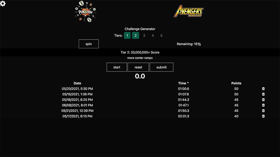
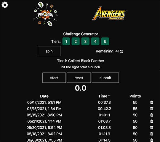
In 2020, I participated in Pinclash, an online pinball tournament. The goal was to achieve certain pinball objectives as quickly as possible. I created a timer & achievement tracker to help me keep track of my progress as I practiced.
The timer would randomly choose an objective and display a stopwatch. Users would start the timer and try to complete the objective as quickly as possible. Users times would be recorded in Firebase and they could track their practice as they tried to beat their previous times. Users could also store personal notes about how they might best complete the objective. The timer was designed to be embedded within a users Twitch broadcast.
That's all folks! Please feel free to if you'd like to chat.